01
Context
02
Visual identity
To provide Lingua T with a fresh identity without disrupting the existing brand recognition and equity, we kept the initial structure of the logo but redefined the colour tones for brighter variations, simplified the lines and created an ad-hoc typography for the name.
We also designed a line of iconographies related to the languages proposed. Finally, we created new elegant and classy business cards.
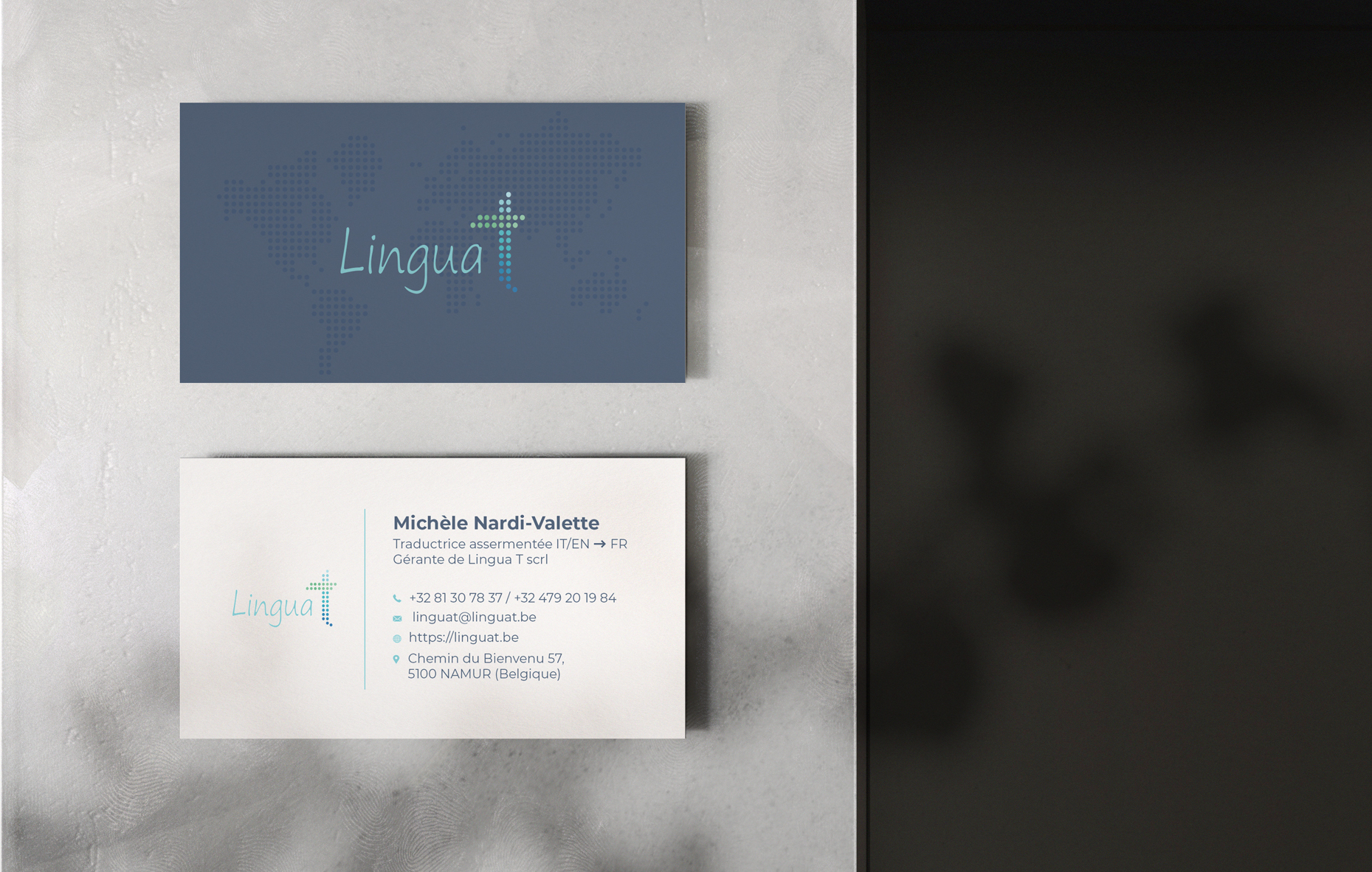
BizCard_linguat01
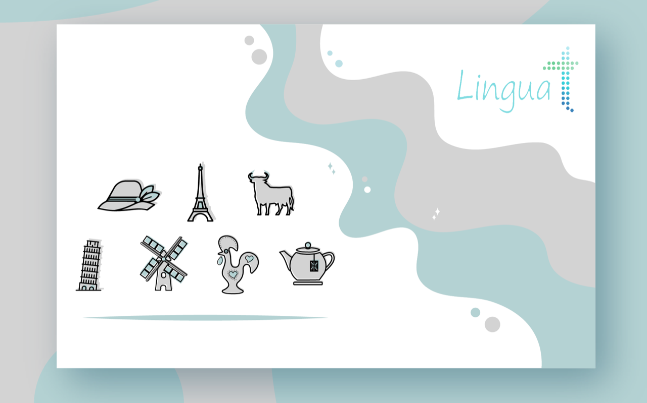
iconos LinguaT
03
Web design
For the new website with a completely new design which highlighted our client’s professionalism and perfectionism with a clean and kind look, proprietary icons and graphs as well as general refined graphic elements. The new website also included a detailed form for direct online quotation requests.
